MinuteRead
30 min
Book summary
Premium summary · Opens in the app · 30 min read
Every day, millions of people sit in conference rooms, lecture halls, and virtual meetings, staring at slides that fail to communicate. The slides are crowded. The text is too small. The charts are incomprehensible. The presenter reads bullet points aloud while the audience checks email. Everyone leaves the room having absorbed almost nothing.
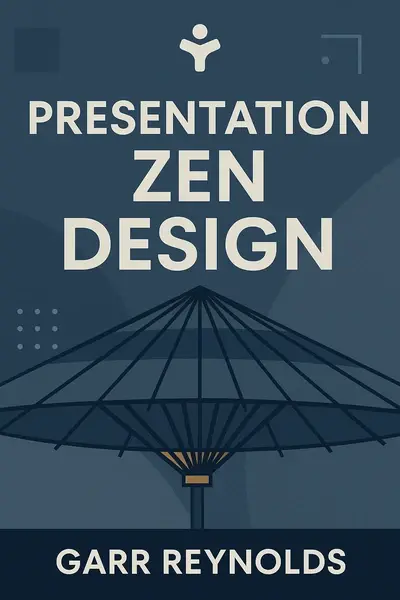
**Author:** Garr Reynolds
**Estimated Reading Time:** 45 minutes
**What You'll Learn:** - Why simplicity is the most powerful design principle available to presenters - How to use typography, color, and imagery with intention and restraint - How to transform complex data into clear visual stories - How to create presentations that feel unified, professional, and memorable - How to apply the Japanese concept of kaizen to continuously improve your design skills
**Who This Book Is For:** Professionals who create presentations and want them to be more than information delivery vehicles. Whether you are an executive, educator, marketer, or student, this book will help you design slides that communicate with clarity, elegance, and impact.
Every day, millions of people sit in conference rooms, lecture halls, and virtual meetings, staring at slides that fail to communicate. The slides are crowded. The text is too small. The charts are incomprehensible. The presenter reads bullet points aloud while the audience checks email. Everyone leaves the room having absorbed almost nothing. This is not a technology problem. PowerPoint, Keynote, and Google Slides are capable tools. The problem is deeper: most presenters have never learned how to design. They treat slides as documents, not as visual aids. They cram every detail onto the screen, believing that more information equals more understanding. The opposite is true. Garr Reynolds wrote Presentation Zen Design to address this fundamental gap. His central insight is that effective presentation design is not about decorating slides or mastering software features. It is about clarity, restraint, and purposeful visual communication. The best slides are often the simplest ones. Reynolds draws on a unique blend of influences. He spent years living and working in Japan, where he immersed himself in Zen aesthetics and the Japanese design tradition. He studied the work of Swiss designers who championed grid systems and typographic clarity. He observed master presenters like Steve Jobs, who used slides as a visual backdrop to their spoken narrative rather than as a script. From these sources, he distilled a design philosophy that is both practical and profound. The core problem Reynolds addresses is that presenters approach slide design from a place of fear. They fear forgetting content, so they put everything on the slide. They fear looking unprofessional, so they add logos, templates, and decorative elements. They fear boring the audience, so they add animations and transitions. All of this fear produces the same result: visual noise that obscures the message. Reynolds offers a different path. He teaches presenters to trust themselves, to trust their spoken delivery, and to let slides do what slides do best: show, not tell. A well-designed slide presents a single idea, a striking image, or a clear data point.…
Continue reading in the MinuteRead app
Get the complete 30-minute summary of Presentation Zen Design
Get the complete summary in the appSimplicity is the foundation of effective presentation design. Remove everything that does not support your message.
Limit your presentation to one or two fonts. Use sans-serif fonts for on-screen readability.
Choose a limited, harmonious color palette. Use accent colors sparingly to highlight key information.
Use high-quality, relevant images. A single powerful image can replace several bullet points.
Simplify data visualization. Show only the data that supports your key message.
Embrace white space. Empty space creates focus, calm, and hierarchy.
"Presentation Zen Design" is a strong fit if you want practical ideas around business, design, communication, especially themes like simplicity is the foundation of effective presentation design. remove everything that does not support your message; limit your presentation to one or two fonts. use sans-serif fonts for on-screen readability. The MinuteRead summary distills these concepts into a focused read, whether you're deciding whether to buy the book or applying its lessons at work.
Garr Reynolds is an internationally acclaimed speaker, author, and presentation design expert. Garr Reynolds draws inspiration from his extensive experience living in Japan, incorporating Zen principles into his approach to presentations. He is known for his ability to blend Eastern and Western design philosophies, creating a unique perspective on effective communication. Reynolds has written multiple books on presentation design and delivery, with "Presentation Zen" being his most famous work. …
View all summaries by Garr ReynoldsContinue Reading
Access the complete 30-minute summary and thousands more nonfiction books in the MinuteRead app.

Continue reading the complete summary in the MinuteRead app.