MinuteRead
30 min
Book summary
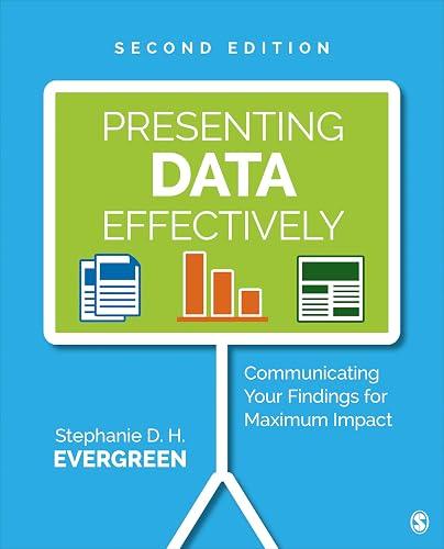
by Stephanie D.H. Evergreen
Premium summary · Opens in the app · 30 min read
Every day, professionals across every industry create reports, presentations, and data visualizations that fail to communicate. The information is accurate. The analysis is sound. The conclusions are important. And yet the audience walks away confused, bored, or indifferent. The report sits unread on a desk. The presentation gets politely applauded and immediately forgotten.
**Author:** Stephanie D.H. Evergreen
**Estimated Reading Time:** 42 minutes
**What You'll Learn:**
- Why your brain processes visuals differently than text and how to use that to your advantage - The specific design choices that make reports, slides, and graphs easier to understand - How to restructure reports so busy decision-makers actually read them - Practical techniques for creating clean, compelling data visualizations - A systematic approach to designing materials that look professional and communicate clearly
**Who This Book Is For:**
This book is for anyone who presents data to others: researchers, analysts, evaluators, marketers, educators, and managers. If you have ever watched an audience's eyes glaze over during a presentation, or sent a report that never got read, or struggled to make a chart that clearly showed what you needed it to show, this book was written for you. You do not need a design background. You need a practical understanding of how to make your data communicate.
Every day, professionals across every industry create reports, presentations, and data visualizations that fail to communicate. The information is accurate. The analysis is sound. The conclusions are important. And yet the audience walks away confused, bored, or indifferent. The report sits unread on a desk. The presentation gets politely applauded and immediately forgotten. The problem is not the data. The problem is not even the audience. The problem is that most people have never been taught how to present information in a way that aligns with how the human brain actually works. Stephanie D.H. Evergreen has spent her career studying this exact problem. As an evaluator and researcher, she watched brilliant colleagues produce work that changed nothing because no one could understand it. As a designer and trainer, she discovered that the gap between good research and good communication was not a matter of talent or creativity. It was a matter of understanding a few fundamental principles about visual processing and applying them consistently. The challenge is that most of us learned to create reports and presentations by copying what we saw around us. We inherited bad habits from previous generations of professionals who inherited bad habits from the generations before them. We produce dense text documents because that is what reports have always looked like. We create cluttered slides because that is what presentations have always looked like. We build complicated charts because we assume complexity signals rigor. But the research tells a different story. The human brain processes visual information in specific, predictable ways. When we align our communication with those processes, our audiences understand more, remember more, and act more often. When we ignore those processes, we force our audiences to work harder than they should have to,…
Continue reading in the MinuteRead app
Get the complete 30-minute summary of Presenting Data Effectively
Get the complete summary in the appThe brain processes visuals faster than text. Use graphics to support your message.
Use no more than two or three fonts per document. Create clear visual hierarchy.
Limit your color palette to two or three main colors plus neutrals. Use color strategically.
Embrace white space. It is active space that supports readability.
Simplify your charts. Remove gridlines, redundant labels, and decorative elements.
Put findings first. Start with an executive summary that presents key findings and recommendations.
"Presenting Data Effectively" is a strong fit if you want practical ideas around business, design, reference, especially themes like the brain processes visuals faster than text. use graphics to support your message; use no more than two or three fonts per document. create clear visual hierarchy. The MinuteRead summary distills these concepts into a focused read, whether you're deciding whether to buy the book or applying its lessons at work.
Motivated to help readers with visual processing theory describes the way the brain perceives and interprets what the eyes see, Stephanie D.H. Evergreen wrote “Presenting Data Effectively” to package those ideas for a fast, focused read. In “Presenting Data Effectively”, Stephanie D.H. Evergreen focuses on visual processing theory describes the way the brain perceives and interprets what the eyes see. Through “Presenting Data Effectively”, Stephanie D.H. Evergreen distills the core ideas on busi…
Continue Reading
Access the complete 30-minute summary and thousands more nonfiction books in the MinuteRead app.

Continue reading the complete summary in the MinuteRead app.