MinuteRead
30 min
Book summary
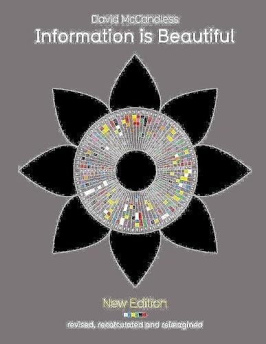
by David McCandless
Premium summary · Opens in the app · 30 min read
We are drowning in information. Every day, the average person encounters more data than someone living a century ago would have seen in a lifetime. News feeds refresh constantly. Statistics appear in every article. Charts, graphs, and infographics compete for our attention. Yet somehow, despite this abundance, we often feel less informed rather than more.
**Author:** David McCandless **Estimated Reading Time:** 42 minutes **What You'll Learn:** How visual design transforms complex data into clear understanding, why concept matters more than complexity, and how to navigate the modern information landscape with sharper critical thinking. **Who This Book Is For:** Anyone who feels overwhelmed by data, curious about how visual storytelling works, or interested in seeing the world through a clearer lens.
We are drowning in information. Every day, the average person encounters more data than someone living a century ago would have seen in a lifetime. News feeds refresh constantly. Statistics appear in every article. Charts, graphs, and infographics compete for our attention. Yet somehow, despite this abundance, we often feel less informed rather than more. The problem is not a lack of information. The problem is that most information arrives in forms our brains struggle to process. Raw numbers blur together. Spreadsheets overwhelm. Long paragraphs of statistics put us to sleep. We scroll past data without absorbing it. We nod along to claims without questioning them. We accept visual presentations at face value without considering whether they are accurate, misleading, or simply confusing. David McCandless saw this problem and asked a simple question: what if information could be beautiful? What if data could be presented in ways that engage our natural visual intelligence, reveal hidden patterns, and make complex subjects genuinely understandable? What if design could do more than decorate, but could actually illuminate? McCandless is a data journalist and information designer who has spent years exploring the intersection of data, design, and meaning. His work has appeared in major publications and been exhibited in galleries worldwide, including the Museum of Modern Art in New York. But his core insight is accessible to everyone: the way we present information shapes what we understand about it. This book is not a technical manual about design software. It is an exploration of how visual thinking works, why some presentations of information succeed while others fail, and how we can all become better at both creating and consuming visual information. McCandless argues that visualization is not merely decorative. It is a tool for understanding. When we see data arranged in a thoughtful visual form, patterns emerge that were invisible in the raw numbers. Relationships become clear. Insights surface. But McCandless also brings a deeper philosophical perspective to his work. He draws on postmodern thinking to challenge the idea that data is neutral or that truth is simple. Every visualization, he argues, is a construction. Every chart reflects choices about what to include, what to exclude, and how to arrange what remains. Understanding this changes how we approach information. We become more critical consumers. We ask better questions. We…
Continue reading in the MinuteRead app
Get the complete 30-minute summary of Information Is Beautiful
Get the complete summary in the appVisualization is translation, not decoration. It makes complex information understandable by mapping data to visual form
Concept is king. A strong organizing idea matters more than technical sophistication, color, or interactivity.
Every visualization is a construction. It reflects choices about what to include, exclude, and emphasize.
Deconstruction is useful. Questioning how claims are built reveals assumptions, agendas, and excluded perspectives.
Simplification is essential. More data does not equal more understanding. Focus on the core insight.
Patterns are everywhere. Look for connections between seemingly unrelated phenomena.
"Information Is Beautiful" is a strong fit if you want practical ideas around design, reference, art, especially themes like visualization is translation, not decoration. it makes complex information understandable by mapping data to visual form; concept is king. a strong organizing idea matters more than technical sophistication, color, or interactivity. The MinuteRead summary distills these concepts into a focused read, whether you're deciding whether to buy the book or applying its lessons at work.
Motivated to help readers with 1) Visualization as a Tool for Understanding Complex Information 2) The Power of Concept in Information, David McCandless wrote “Information Is Beautiful” to package those ideas for a fast, focused read. In “Information Is Beautiful”, David McCandless focuses on 1) Visualization as a Tool for Understanding Complex Information 2) The Power of Concept in Information. Through “Information Is Beautiful”, David McCandless distills the core ideas on design into lessons r…
Continue Reading
Access the complete 30-minute summary and thousands more nonfiction books in the MinuteRead app.

Continue reading the complete summary in the MinuteRead app.