MinuteRead
30 min
Book summary
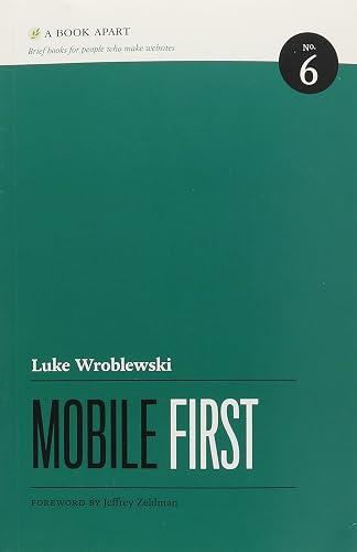
by Luke Wroblewski
Premium summary · Opens in the app · 30 min read
In 2007, a small device changed everything. When the iPhone arrived, it did more than introduce a new product category. It fundamentally altered how people access information, communicate, and interact with the digital world. Within a few years, the mobile phone transformed from a convenient accessory into the primary gateway to the internet for hundreds of millions of people.
**Author:** Luke Wroblewski **Estimated Reading Time:** 42 minutes
**What You'll Learn:**
- Why designing for mobile first leads to better products across all platforms - How constraints like small screens and slow networks drive innovation - Practical techniques for touch interfaces, responsive layouts, and simplified forms - How to leverage device capabilities like location, cameras, and sensors - A framework for navigating the constantly shifting mobile landscape
**Who This Book Is For:**
Designers and developers who want to create digital products that thrive in a mobile-dominated world. Product managers and business leaders who need to understand why mobile strategy matters. Anyone building websites or applications who wants to reach users where they actually are: on their phones.
In 2007, a small device changed everything. When the iPhone arrived, it did more than introduce a new product category. It fundamentally altered how people access information, communicate, and interact with the digital world. Within a few years, the mobile phone transformed from a convenient accessory into the primary gateway to the internet for hundreds of millions of people. Yet most organizations were caught off guard. For years, the standard approach to mobile design was simple: build for the desktop first, then shrink things down. Take the full website, strip away what seems unnecessary, and hope for the best. The result was predictable. Cluttered interfaces. Frustrating navigation. Slow load times. Users tapping at tiny links designed for mouse pointers. The mobile experience felt like an afterthought because it was one. Luke Wroblewski saw this problem early and clearly. As a designer who had spent years studying how people interact with digital products, he recognized that the mobile revolution required more than a technical adjustment. It demanded a fundamental shift in thinking. The core problem is not screen size. The core problem is priority. When you design for the desktop first, everything seems important. There is room for endless navigation menus, sidebars, promotional banners, and social widgets. The desktop canvas is generous, and that generosity breeds clutter. By the time you try to squeeze all of that into a mobile screen, you face an impossible task. You cannot fit everything, so you make compromises. You hide features. You shrink text. You create a diminished version of your product. Mobile First flips this approach entirely. Instead of starting with abundance and cutting down, you start with scarcity and build up. You begin with the smallest screen, the slowest connection, and the most distracted user. You ask a simple question: what matters most? What does this person actually need to accomplish? What is the core value we provide? Answering these questions forces clarity. It strips away the nice-to-haves and reveals the must-haves. It pushes you to…
Continue reading in the MinuteRead app
Get the complete 30-minute summary of Mobile First
Get the complete summary in the appDesign for mobile first, then expand to larger screens.
Embrace constraints. They force focus and drive better design.
Lead with content. Navigation is secondary on mobile.
Make touch targets at least 7 to 10 millimeters, roughly 44 to 57 pixels.
Minimize typing. Use defaults, appropriate keyboards, and device capabilities.
Leverage mobile capabilities like location, camera, and touch to create new experiences.
"Mobile First" is a strong fit if you want practical ideas around design, technology, business, especially themes like design for mobile first, then expand to larger screens; embrace constraints. they force focus and drive better design. The MinuteRead summary distills these concepts into a focused read, whether you're deciding whether to buy the book or applying its lessons at work.
Motivated to help readers with "Websites and applications should be designed and built for mobile first." Mobile is exploding, Luke Wroblewski wrote “Mobile First” to package those ideas for a fast, focused read. In “Mobile First”, Luke Wroblewski focuses on "Websites and applications should be designed and built for mobile first." Mobile is exploding. Through “Mobile First”, Luke Wroblewski distills the core ideas on design into lessons readers can absorb in a single short sitting. Readers turn…
Continue Reading
Access the complete 30-minute summary and thousands more nonfiction books in the MinuteRead app.

Continue reading the complete summary in the MinuteRead app.